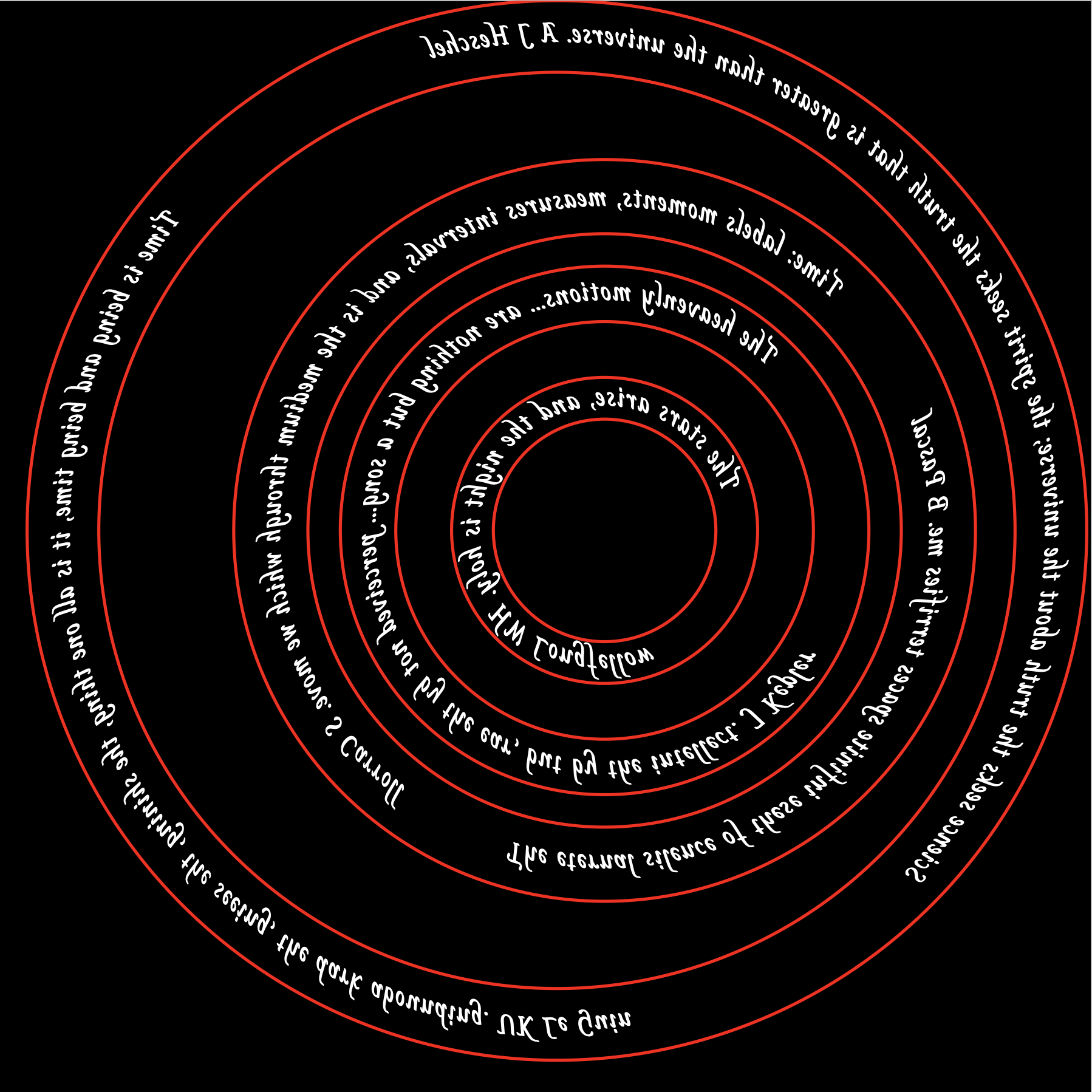
This is just a fragment of the first version to modify the printouts for the text following the curves around the planet rings. There are two rings, Earth & Mars with two quotes each. These quotes need greater separation. The number of spaces was modified until the two quotes seemed equally spaced, before and after. All four rings have the red circle that anchors the text in an arc. These circles need to be changed to black so they will not affect the etching. To do this the color of the path was changed from #ff0000 to #000000. All other parts of the previous page have been deleted. The screen view was captured, saved as a png (Rings with spaced quotes.png) and included below. Ready to be printed on OHP acetate!
The SVG path begins by Moving the pen to M50,200. An Arc is then drawn. The first two numbers (100, 100) are the radii in x and y directions. The last two numbers (51,201) are the endpoint of the arc. The zero is a flag for x-axis rotation and is seldom used. The first 1 is a flag for "large arc". When on, a large arc is drawn to connect the two points, while off a smaller connecting arc is drawn. The last flag sets the direction of the arc. 1 is clockwise. A test version was printed out with black letters on a white background. The printed circles are 7% larger than the screen sizes, so the SVG code was adjusted accordingly. The following SVG code gives the correct sizes for Mercury, Venus and Earth. To easily cut out the circles the SVG should include inside and outside circles for each planet or marked centerpoints. Need longer quotes for Venus (30%) and Earth (50%) as well as adding inside and outside circles. [Note: this was all done with the Safari browser.] The following SVG code was optimized in the testing page and pasted in place here. As seen above this does not print out what is seen on the screen so a screen shot was taken, the SVG code was commented out, and the screen shot was used in its place.
Ran the above script to get a picture on the screen. This was captured with Screen Capture and saved as a png file. This png file was opened with Preview and saved as a pdf file. The file was saved in iCloud and then mailed to OfficeDepot@printme.com. The pdf was printed on acetates provided by the attendant. The Mercury ring was removed from the orrery and polished again to remove some tarnish that was starting to appear. After washing with soap and water and degreasing with acetone it was held above the appropriate printed ring, only to discover that the printed ring was too big!!! I now need to go back through the process to determine where the size change occurred. It looks like conversion from png to pdf changed the size from 2" to 2 3/8". The next attempt was to open a pdf and drag the thumbnail from the opened png file into the new pdf. Unfortunately, this also changed the size of the ring (2" to 2 1/8"). Now what?
A path forward is simple enough. Heard from an Apple discussion that Preview automatically compresses image files and this is responsible for size changes. So this is a no go, unless I switch to a high-end program like Adobe. Looking on the PrintMe website indicated that png is an acceptable file format for their software and printers. So it is back to Office Depot to print this yet again. Purchased acetates (100 for $46!) at Staples.
I have returned to the orrery in late June after four and one-half months. I realized a major problem with the engraving on the top dodecagon of the frame. The months are arranged in a clockwise order. Of course the planets revolve around the sun counterclockwise!!! That and my dislike of the engraving itself implies it needs to be redone. There was one more problem with the top frame: the finish. I do not like the way the spray varnish looks. It looks "pebbly". So I will flip the frame top over and etch the new top side. The drilling and engraving are too deep to attempt to sand them off. Probably 1/32" of brass would need to be removed. I might need to open the holes for the column screws to provide enough leeway to flip the dodecagon.
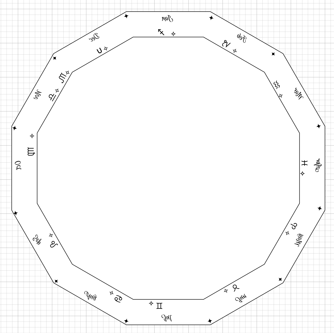
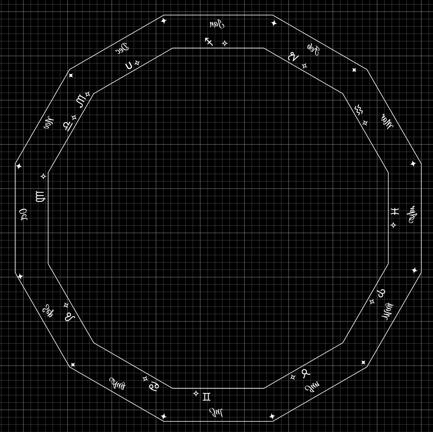
I decided to use a program called Graphic. It allows dimensional control, but functions more like a graphics program. I do not remember why it did not work for text around circles forcing me to learn SVG. In any event this seemed like a simpler task for which Graphic seemed suited. It is also very easy to use. The plan is to etch three things into the dodecagon: the month abbreviations, the astronomical symbols, and the tick marks (beginning and ending months and constellations). The dodecagon was easily made to exact dimension. The diameters of dodecagons are 9 3/16" and 7 11/16". These two dodecagons were drawn and quickly aligned by eye.
The months were a perceptual challenge. Since, the printout needs to be flipped, they were arranged clockwise around the dodecagon sections. Actually flipping the text was slightly confusing: do the months on the sides need to have their text flipped backwards? Well it turns out they do. So each block of text created was first flipped so it was a mirror image of the original. I proceeded around the dodecagon in a clockwise direction with the months. "Jan" at the top was first. It was flipped, put in place and then duplicated. The duplicate was dragged to the approximate new position. The text was changed and the text was rotated 330°. (The dihedral angle of a dodecagon is 150°.) This was continued around the dodecagon until all 12 months were flipped, rotated and in position. This file was saved as "Dodecagon for etch.idraw". The font used is "Euphoria Script", size 16.
Next up were the astronomical symbols. The Arial font has all of them except Ophiucus. They were pasted into a TextEdit document, because it has a great font viewer. From TextEdit each was pasted into a new text block. These blocks then went through the same process as above, though some of the symbols are symmetrical and did not require flipping. Each was carefully placed in relation to the month abbreviation so they would turn out similar to the current placement. Since there is no symbol for Ophiucus, I decided to use the mathematical union symbol. The Ophiucus symbol is a "U" with a wavy line through the middle. I can just scratch the wavy line into the printed "U" prior to transferring ink to brass. The file was saved at this point as "Dodecagon for etch 2.idraw". The Arial font was used here (it is one of the few fonts with all of the symbols) also in size 16.
The file "Dodecagon for etch 2.idraw" was printed on two pages. First of all looking at the printout in the mirror indicated that all of the flipping and rotation gave the correct orientation and positioning of the different elements. Measurements were taken and the sizes of the printed dodecagon were spot on. These files are still black on white and will need to be turned into negatives prior to printing for etching.
Checking the online orrery for consistency and it shows December at the top of the picture. Currently, I have January at the top when the crank is on the right. This needs to be changed. This movement should help relieve the Libra, Scorpius, Ophiucus crunch from November to December. Currently there is a column screw right in the middle of Scorpius, which is the shortest constellation period. Consequently, it is the most cramped constellation and can't handle the screw in its midst. This shift will move that screw to the end of October a definite improvement. The next screw moves from August to July. It may impinge a little on Cancer, but there are few stars in Cancer. The next screw moves from May to April and there is plenty of room for it there. The final screw moves from February to January and again there is plenty of room.
The month and constellation separators were added last. Two diamonds, filled and open, were used for the separators. Again they were pasted in from TextEdit and rotated. No flipping was needed as they are symmetric. These diamonds are again Arial font so they should be readily available when printing. (Though the entire picture will probably be converted to a PNG prior to printing.) The separators were placed pretty close to the line and at appropriate locations as close as possible to where they were in the engraved version. A picture of the final file, "Dodecagon for etch 3.idraw" is below. Alongside it is the "negative" version for the etching print. (The actual file is saved without the grid lines.)
The plan at this point is to print all of the PNG files on the home printer and double check sizes. Then the same files will be printed on the laser printer at Office Depot. These etching printouts will be transfered to the brass. The brass will be etched after sanding and polishing. The constellations will then be drilled as done previously. The month abbreviations, constellation symbols, and separators will be highlighted with either blue or black fingernail polish. Finally, the surface will be coated with some type of varnish. All of the steps from the etching on (except drilling) will require a significant amount of experimentation on brass samples.
I got some printing done at OfficeDepot finally. Not quite what I wanted, but that is another story. I had a section of dodecagon polished but with a little tarnish. I saw recommendations on the web for a paste of salt and lemon juice for removing tarnish from brass. After a lot of elbow grease expended I could see no evidence of tarnish removal. So I sanded the scrap with 220 to 1500 grit. It was then polished on the cotton wheel with red rouge. It had a nice shine so I decided it was ready for transfer experiments.
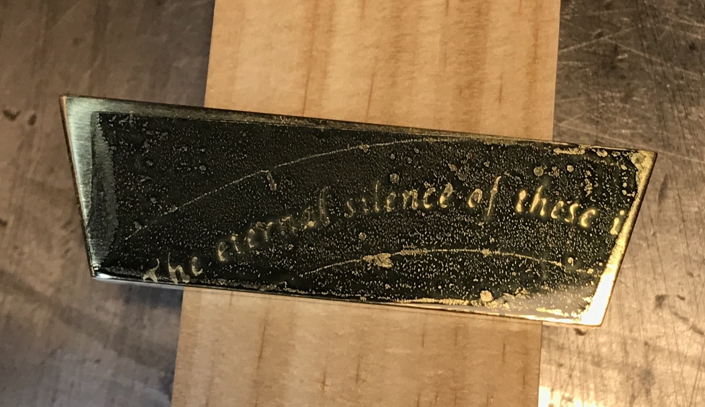
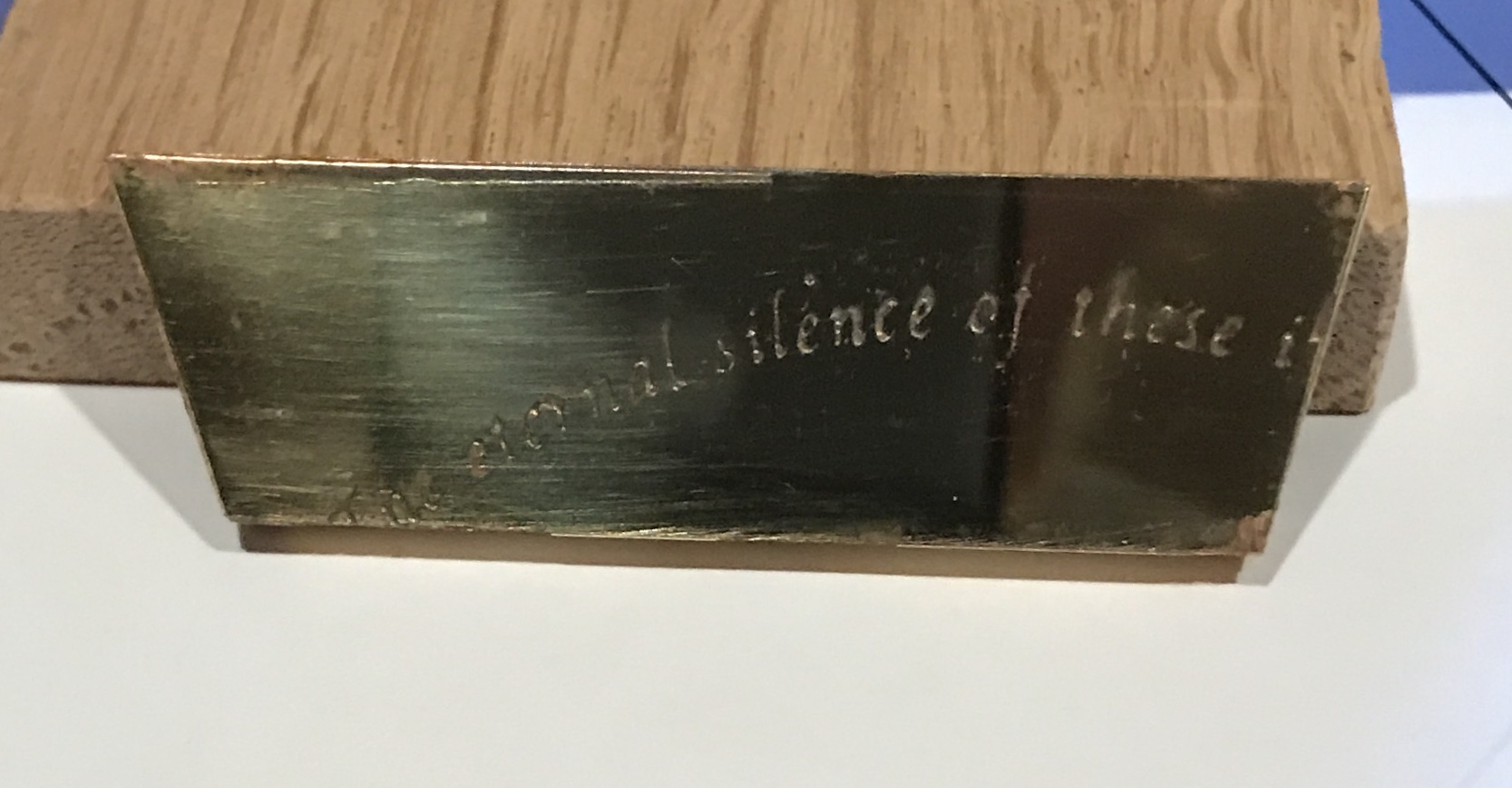
A fragment of one of the acetates was cut out and taped to the brass with masking tape. The hot iron (as hot as it will go) was applied to the taped acetate for two minutes. The tape was peeled off and the acetate removed. There was only partial transfer. The tape glue was removed with mineral spirits and the transfered ink with acetone for another trial. To make a long story short after eight attempts I found that the ideal conditions were as follows: an even thickness of tape across all of the part, taped in two directions to make sure the acetate was held tightly to the brass, iron temperature set just below "cotton", three and one half minutes of heating using the heel of the iron with the part sitting on a wooden block, the iron was kept resting on the part with back and forth movements to ensure even heating, and the part was removed from the wood block and set on the cast iron table saw table for quicker cooling. Two pictures of the successful transfer are below.
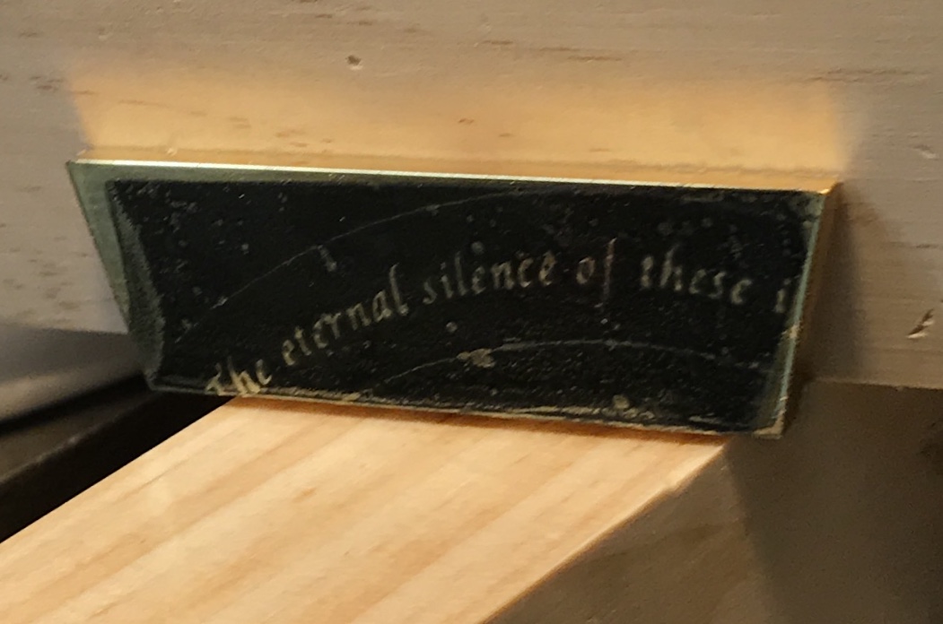
As can be seen the "successful transfer" is not perfect. This could be due to a number of factors. The ink on this acetate was not very thick. Others may be better as they are printed by OfficeDepot on their commercial printers, not on the one for customer use. It is possible the time could be extended to four minutes. One of the problems seen early on was ink flow. If the brass was heated too long the text was cloudy and could disappear entirely. It was difficult to find a time between three and four minutes that produced good transfer without ink flow. That was the reason to drop to a lower temperature. At this lower temperature I have not pushed the time long enough to see evidence of ink flow.
One final note. The length of heat application will need to be adjusted for the thickness of the brass part. The time it takes to get the part hot enough to melt and transfer the ink will most likely vary based on the thickness of the part. Doing a large part may be quite the challenge. At least it is simple to clean the ink from the part and try again.
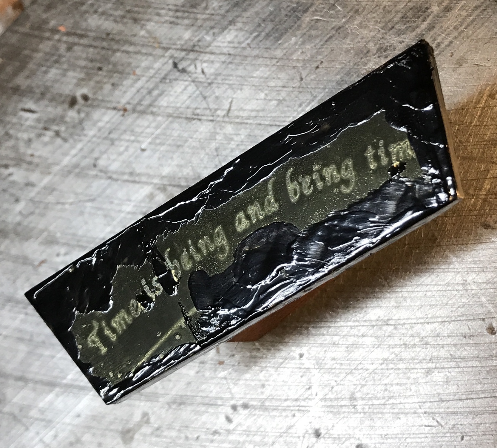
This morning etching was begun! The brass part above was prepared by covering some areas with fingernail polish, mostly where the ink did not transfer sufficiently. It was also taped with Scotch clear packing tape on the sides and the back. Using a rolled bit of the tape it was attached to a block of styrofoam. A small tape handle was attached to the back of the styrofoam block. The purchased condiment tray was used to hold the etchant. In fact the etchant was poured into the dip bowl in the center of the tray. Only about 1/4" was added. The brass part was lowered into the ferric chloride solution. It was kept in the bath for 40 minutes. It was agitated every few minutes for one minute over the last half hour. It was removed and the acid rinsed off with the garden hose. The tape was removed and the ink was wiped off with acetone. Further rinsing with a solution of baking soda was followed by water and drying with acetone. The result is below.
The etching needs to go longer than the 40 minutes done here. Alternatively, the acid could be warmed up for a faster reaction. The taping needs to be more carefully done. There are a few places along the edges where the acid got to the metal and did a nice job etching. On the whole though, I am pleased with this first attempt.
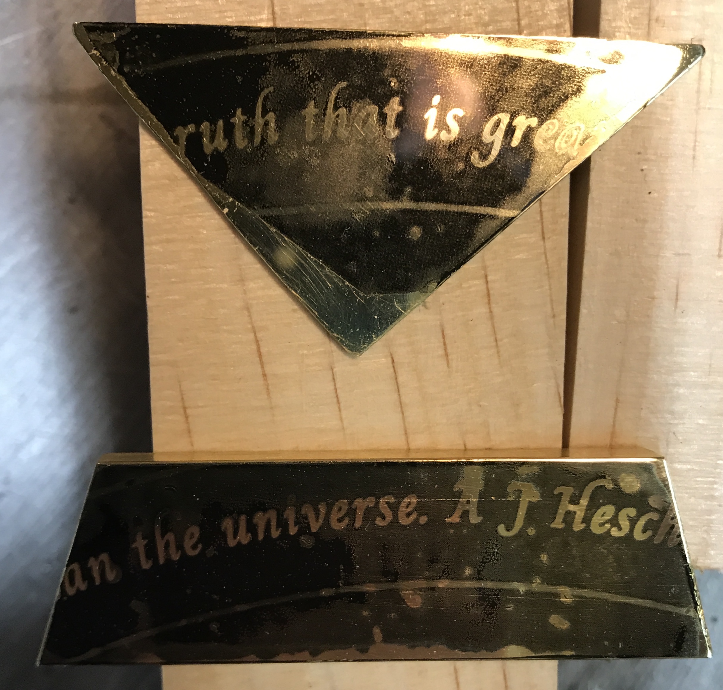
This morning I will make a second attempt to etch the brass. I plan on keeping the iron on the brass for 4 minutes and etching longer with more consistent agitation. The first shot at 4 minutes again led to flow, not as much as at the higher temperature, but still quite noticeable. So a second attempt was made at three and one-half minutes. It looked good except for some spots that got no transfer. I painted on the fingernail polish an the sides and on the face where the black ink was a little hazy. I also filled in some spots on either side of "is". These fixes can be seen in the following photo.
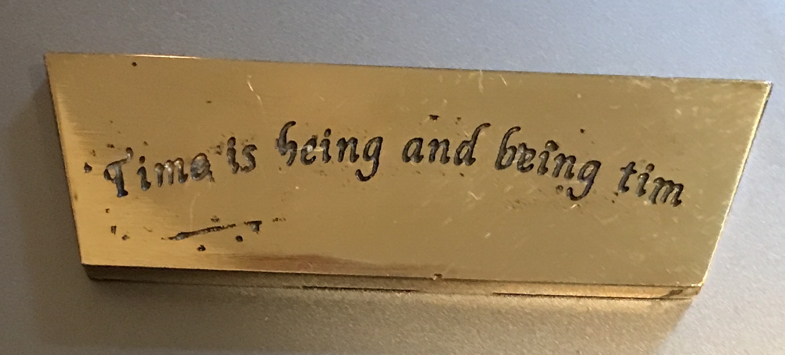
I am not sure how long to let the fingernail polish dry before applying the tape and etching the brass. I will wait one hour to make sure. After one hour the brass was taped with packing tape. It was taped to the styrofoam block and the block was given a tape handle. A little more FeCl3 solution was added to the bowl and the brass was etched for one hour. It was agitated every five minutes for one minute. It was then thoroughly rinsed outside and then neutralized with baking soda. The paint and ink were removed with acetone. As can be seen in the picture below the etching went very well. It is etched significantly deeper than the first attempt. The real challenge is still the transfer. The transfer glitches are clearly visible even after trying to touch up some of them with fingernail polish.
An attempt was made to improve the transfer. A printout from a different printer was used and taped to a newly polished brass scrap. After 3 1/2 minutes of heating with the iron the part was cooled. The tape was removed and once again the transfer was mostly ok, but there were multiple spots that did not transfer the ink. A small scrap of 1/16" brass was also polished. A piece of transparency with text was taped to one side. The brass was only heated for one minute and ten seconds. Removing the tape showed significant flow in this short period. Maybe 45 seconds would be more appropriate for this thinner brass.
Looking on the internet there were a few recommendations for how best to transfer ink to metal. One author indicated that two variables were the most important, temperature and pressure. The second surprised me. This author had taken an old iron, took it apart and attached the bottom face up on a support. He only heated the iron to 135° C. He used a rolling pin with his body weight to apply the pressure for one to two minutes. Well I was not able to completely use his methodology. I lowered the temperature of the iron to just under wool (wool is ~148° C) and leaned hard on the iron. Two minutes for the 3/16" and fifty seconds for the 1/16" brass. The iron could not be moved during the application of pressure. The results are seen in the following picture.
The results were mixed. The letters are very well formed, but the transfer is rather blobby. More ink was transfered in some places than others. There are still spots that did not transfer, though fewer in the places where the ink transfered well, e.g. the left side of the dodecagon part. It is likely the weight would work better if the force could be spread evenly over the part like for instance with a rolling pin. How easy would it be to build a support for the iron??